Web design is one of those fields where the landscape shifts constantly. What looked cutting-edge two years ago can feel dated today. Staying ahead of trends is important, not because you should chase every new fad, but because understanding where design is heading helps you make better decisions for your website and your business.
At Life By Designs, we pay close attention to emerging design trends while staying grounded in timeless principles. A trend is only worth adopting if it genuinely serves your users and supports your business goals. With that filter in mind, here are the web design trends that we believe are shaping the future of the web.
Bold, Oversized Typography
For years, the web relied heavily on images to make visual impact. That is changing. Designers are increasingly using large, bold typography as the primary visual element on a page. A powerful headline set in an oversized, expressive typeface can be more attention-grabbing than any photograph.
This trend is driven by several factors. Web font technology has matured significantly, giving designers access to thousands of high-quality typefaces that load quickly and render crisply on all devices. Performance-conscious designers also appreciate that text is far lighter than images, contributing to faster load times.
The key to making bold typography work is restraint. One dramatic typeface paired with a clean sans-serif for body text creates a striking contrast. Using multiple display faces or trying to make every element on the page bold creates visual chaos. The power of a large headline comes from the contrast with the quieter elements around it.
Generous White Space
Also known as negative space, white space is the empty area between and around elements on a page. For years, many business owners saw white space as wasted space and wanted every square inch of their website filled with content. That mindset is shifting, and the web is better for it.
Generous white space creates a sense of sophistication, clarity, and focus. It gives content room to breathe, makes text more readable, and guides the eye naturally from one element to the next. Apple, widely regarded as one of the best-designed companies in the world, uses white space masterfully throughout their website.
From a practical standpoint, white space also improves usability. Touch targets are easier to hit when they have ample spacing. Text is easier to read when lines are not packed tightly together. Calls to action stand out more when they are surrounded by open space rather than competing with dozens of other elements.
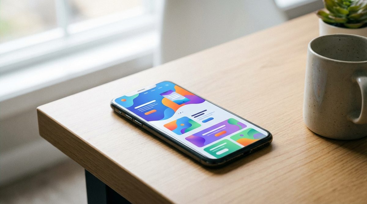
Card-Based Layouts
Pinterest popularized the card layout pattern, and it has since become one of the most common design approaches on the web. Cards are self-contained units of content, typically consisting of an image, a headline, a brief description, and a link. They work beautifully for presenting collections of similar items: products, blog posts, team members, portfolio projects, or services.
What makes cards so effective is their flexibility. On a desktop, cards can be arranged in a multi-column grid. On a tablet, the grid can adjust to two columns. On a phone, cards stack vertically into a single column. This natural responsiveness makes card layouts inherently mobile-friendly.
Cards also align well with how people consume content on the web. Users scan rather than read, and cards present information in digestible, scannable chunks. Each card provides just enough information to help the user decide whether to click through for more details.
Micro-Interactions
Micro-interactions are small, subtle animations and feedback moments that occur when a user interacts with a website. A button that changes color when you hover over it. A form field that gently highlights when you click into it. A subtle animation that plays when you scroll to a new section. A loading indicator that tells you something is happening.
These tiny details might seem insignificant, but they have an outsized impact on the user experience. Micro-interactions make a website feel alive, responsive, and polished. They provide feedback that confirms the user's actions, reducing confusion and building confidence in the interface.
The trick is subtlety. Micro-interactions should enhance the experience without drawing attention to themselves. If a user consciously notices an animation, it is probably too much. The best micro-interactions are felt rather than seen; they create a sense of smoothness and quality that the user may not be able to articulate but definitely appreciates.
Full-Screen Video Backgrounds
Video backgrounds have been trending for a couple of years now, and they continue to gain traction as bandwidth increases and video compression improves. A well-produced background video can convey atmosphere, emotion, and brand personality in a way that static images simply cannot.
However, this is a trend that requires careful execution. A poorly chosen video, one that is too busy, too slow to load, or distracting from the content, can actively harm the user experience. Best practices include:
- Keep the video short (15 to 30 seconds) and loop it seamlessly
- Use a dark overlay to ensure text remains readable on top of the video
- Provide a fallback image for mobile devices and slow connections
- Never auto-play sound; users should opt in to audio
- Compress the video aggressively; file size is critical for performance
At Life By Designs, we use video backgrounds selectively. They work well for creative agencies, restaurants, travel companies, and other businesses where visual storytelling is central to the brand. For service-based businesses where the content is the star, a clean static design is often more effective.
Scroll-Based Storytelling
Long-scrolling pages have replaced the multi-page website for many businesses, and designers are getting increasingly creative with how they use the scroll. Instead of simply stacking content sections vertically, scroll-based storytelling uses the scrolling action itself as a narrative device.
Elements fade in, slide in, or transform as the user scrolls down the page. Parallax effects create a sense of depth. Content is revealed progressively, building a narrative arc that guides the user from introduction to conclusion to call to action.
When done well, scroll-based storytelling creates an engaging, immersive experience that feels more like flipping through a magazine than reading a webpage. When done poorly, it feels gimmicky and slow. The key is to use these techniques to serve the content, not to show off the designer's technical skills.
Custom Illustrations
Stock photography has dominated the web for years, and users have developed a subconscious ability to spot it. That generic photo of a smiling businesswoman shaking hands? Everyone has seen it a hundred times. It communicates nothing unique about your brand.
Custom illustrations are emerging as a powerful alternative. Hand-drawn or digitally created illustrations give a website a distinctive personality that stock photos cannot match. They can be tailored to your brand's color palette, tone, and message. They are inherently unique because they are created specifically for you.
Companies like Dropbox, Slack, and Mailchimp have embraced custom illustration as a core part of their visual identity, and the trend is filtering down to smaller businesses. While custom illustration requires a larger initial investment than stock photography, the impact on brand differentiation and user experience is significant.
Accessibility as a Design Principle
Accessibility, designing websites that can be used by people with disabilities, is moving from an afterthought to a core design principle. This is a trend we at Life By Designs strongly support. Beyond the ethical imperative, accessible websites are simply better-designed websites. The practices that make a site accessible, such as clear typography, strong color contrast, logical heading structure, and keyboard navigation, improve the experience for all users.
Key accessibility considerations include:
- Sufficient color contrast between text and background (WCAG AA standard recommends at least 4.5:1 for normal text)
- Descriptive alt text for all images
- Logical heading hierarchy (H1, H2, H3 in order)
- Keyboard-navigable interactive elements
- Form labels that are clearly associated with their fields
- Readable font sizes (minimum 16 pixels for body text)
Trends vs. Timeless Principles
While it is valuable to be aware of current trends, the most important design principles are timeless. Clean layouts, clear communication, fast performance, and intuitive navigation will never go out of style. At Life By Designs, we use trends as inspiration, but we build on a foundation of proven principles.
If you are thinking about a new website or a redesign, we would love to help you find the right balance between contemporary design and enduring quality. Contact Life By Designs to start the conversation.